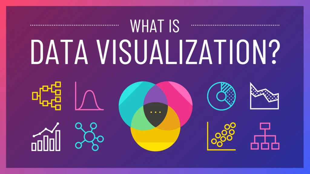
Data visualization, along with the broader concept of communicating through data, exists at the intersection of science and art. While it entails adherence to best practices and guidelines, there’s also an artistic dimension to it. This diversity makes the field particularly enjoyable, as individuals bring varying perspectives and solutions to the same visualization challenges. Recently, I completed Cole Nussbaumer Knaflic’s “Storytelling with Data,” a masterful blend of artistry and business acumen. This accessible guide offers invaluable insights for anyone seeking to connect more effectively with their audience using data. Below are the top five tips from the book’s final chapter, encapsulating its key lessons.
Tip #1 — Master Your Tools
Avoid letting your choice of tools hinder your ability to communicate data effectively. While familiarity with basic tools can be advantageous, you don’t necessarily need sophisticated software to create compelling visualizations. Here’s a brief overview of some popular tools currently used for data visualization:
Google Spreadsheets: Free, online, and collaborative, enabling multiple users to edit simultaneously.
Tableau: A widely-used out-of-the-box visualization solution, ideal for exploratory analysis due to its ability to swiftly generate multiple views and attractive graphs. While it can be costly, a free version, Tableau Public, is available for those comfortable sharing data on a public server.
Programming Languages: Such as R, D3, and Python, offer greater flexibility albeit with a steeper learning curve. They empower users to control specific graph elements and replicate those specifications through code.
Adobe Illustrator: Some opt to use Illustrator alone or in conjunction with graphs from tools like Excel or generated through programming languages. This approach facilitates easier manipulation of graph elements and lends a professional aesthetic to visualizations.
Tip #2 — Refine and Solicit Input
Achieving a final solution often requires iteration. When unsure of the best approach to visualize certain data, start with a blank canvas. This allows for brainstorming without being confined by tools or existing knowledge. Sketch out potential views to compare them and determine the most effective method for conveying your message to the audience.
If uncertainty persists at any stage, seek feedback. Another perspective, whether from a friend or colleague, is invaluable. Share your visualization and have them articulate their thought process: what they notice, their observations, questions, and suggestions for clarity. These insights indicate whether the visualization is effective or where adjustments are needed, facilitating ongoing refinement.
Effective iteration requires a significant investment of time.
Tip #3 — Invest Time in Data Storytelling
Crafting a compelling narrative with data demands time. It involves understanding the context, audience motivations, and crafting a concise story with a central idea. Analyzing data from various angles, decluttering, seeking feedback, and refining visuals are all time-consuming tasks. Combining these elements into a cohesive narrative takes additional time, especially given that communication is the final step visible to the audience. Allocate ample time for thorough iteration to ensure accuracy.
Tip #4 — Draw Inspiration from Exemplary Models
Emulating successful data visualizations is beneficial. Analyze effective examples, identifying what makes them impactful. Build a repository of these examples for reference and inspiration. Learning from experts through emulation is valuable, akin to art enthusiasts sketching interpretations of masterpieces. Numerous resources and blogs offer excellent examples; consider starting with the Data Visualization Society.
Tip #5 — Embrace Creativity and Develop Your Style
Data visualization allows for creativity, despite the misconception that data is devoid of it. Data can be presented beautifully, encouraging experimentation with new approaches. Over time, you’ll discern what works best. Allow your unique style and creativity to shine through in your communication. Company branding can influence visualization style; consider integrating brand elements while ensuring clarity for the audience.
The book caters to anyone tasked with communicating data insights, including analysts, students, managers, philanthropists, and leaders. It provides valuable guidance for enhancing data communication skills in various contexts, offering reassurance to those daunted by the prospect.